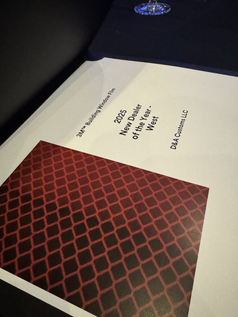
D&A Customs has received recognition from 3M as the Best New Dealer on the West Coast, which reflects the quality and consistency our team offers on every installation.
This award demonstrates a long-standing partnership between D&A Customs and 3M, one of the most respected manufacturers of window films and graphics products in the industry. From commercial window tinting and security film installations to vehicle wraps and architectural graphics, our team has focused on delivering precise work and reliable service from day one.
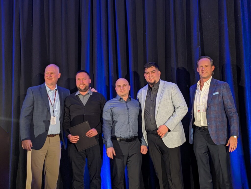
For our customers, this means that the materials being used to install your products are manufactured by industry-leading companies, and the final installation will be performed by professionals who consistently meet the manufacturers’ standards.
The support we have received from our clients and the 3M dealer network has enabled us to receive this kind of recognition, and it continues to motivate us to improve our craft while raising the standards of excellence for all future work we complete.
DA-Customs is proud to continue supporting the expanding Sound Transit system, with the recent addition of the new Crosslake Connection stations, which will be opening March 28. For more than six years, DA-Customs has been a provider of anti-graffiti window film services to Sound Transit, specifically within the Sound Transit rail stations.
The main focus of our work has been the application and replacement of anti-graffiti window film on the various types of glass throughout the entire station. The window film is a cost-effective solution for protecting window surfaces against tagging, surface scratches, and surface damage; it also allows for quick repair of windows when they have been vandalized, without the replacement of the glass itself. By using the anti-graffiti window film, the repair time is reduced, service disruptions are limited, and maintenance costs are reduced over the long term.
The Crosslake Connection is a major upgrade in terms of providing new access routes between the Eastside and Seattle, as well as providing new commuting options for individuals who commute daily. DA-Customs is working hard to ensure that the windows in each of the new Crosslake Connection stations will be maintained and ready for public use at all times, as the stations open.
For more information on the Crosslake Connection and opening day timeline, please visit: https://www.soundtransit.org/crosslake
The recent announcement that Alaska Airlines has made a major aircraft purchase from Boeing is quickly gaining attention across the industry. Beyond the scale of the deal itself, it highlights a broader reality: when fleets grow fast, branding becomes an operational priority, not a finishing touch.
Each new aircraft entering service must align with strict visual standards, maintain brand recognition, and stay consistent with the existing fleet. Expansion at this level requires planning that goes well beyond delivery timelines.
The same principle applies on the ground.
As fleets expand—whether in aviation, transportation, or campus operations—vehicles need to look unified from day one. That is where DA-Customs adds value. For the AAG campus shuttle fleet, DA-Customs delivered a full solution, handling design, print, and professional graphics installation to ensure consistency across multiple vehicles.
Projects like this show how fleet wraps support growth. They allow new vehicles to be deployed quickly, keep branding consistent, and make future expansion easier. As Alaska Airlines’ Boeing purchase demonstrates on a global scale, fleet growth and branding now go hand in hand—both in the air and on the road.


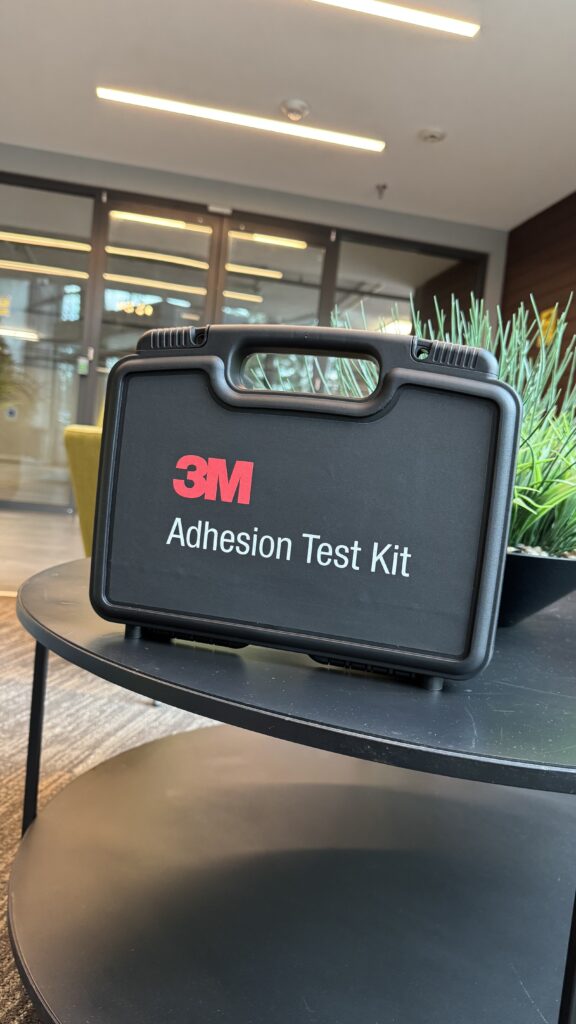
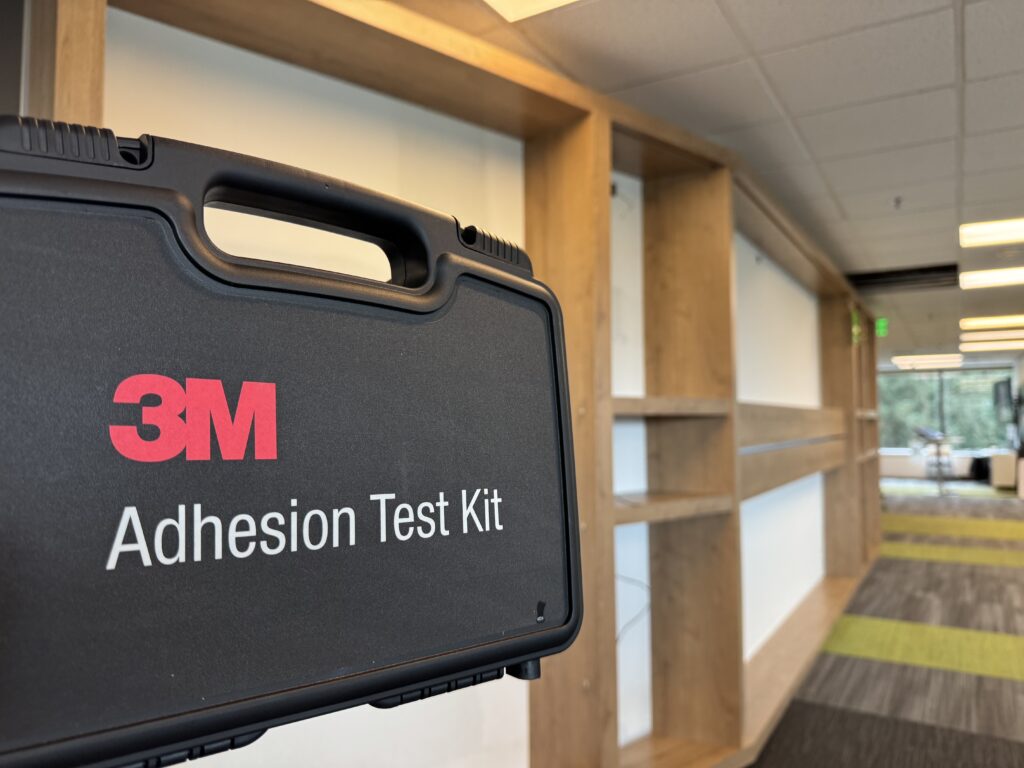
Before installing 3M DI-NOC, it is worth slowing down for a quick check that can prevent real problems later. A wall or door may look clean and solid, yet the film can still fail if the paint is too fresh, the surface is sealed, or the material has low surface energy. The 3M Adhesion Test Kit helps spot these issues before any large sheets go up. In this guide, we explain why this test matters, what it tells you about a surface, and how it helps avoid edge lift, peeling, and costly rework on DI-NOC projects.
A quick adhesion test can save you from the most annoying DI-NOC problems: edges that lift, corners that pull back, and panels that start to peel after the job “looks done.” 3M calls out this risk in its DI-NOC guidance and says wall paint must fully cure, plus you should run the 3M adhesion test for each product and each different wall you plan to wrap.
For the test result itself, 3M’s DI-NOC installation guide gives a clear benchmark: about 800 grams of initial adhesion (measured with a spring scale) as a recommended target to hold the film in place during installation.
The 3M adhesion test kit is a straightforward way to see how DI-NOC will behave on a real surface, not a sample board. It uses small test pieces placed right on the wall, door, or panel you plan to wrap, then checks how firmly the film holds when pulled. This matters because surfaces that look identical can act very differently. One wall may grab the film right away, while another lets it slip due to paint type, sealers, or past patchwork. The test gives a clear answer before you commit material and labor, so there are no surprises after installation.
An adhesion test makes sense any time a surface gives you even a small reason to pause. Fresh paint is the most common case, especially low-VOC paints that feel dry to the touch but have not fully cured. 3M points out that paint cure time depends on the product and site conditions, and uncured paint can cause a weak bond or paint pull when the film is removed. 3M also recommends running adhesion tests on each surface and paint system, not just once per job. On real projects, one wall may work fine while the next fails due to a different paint batch, repair, or sealer.
At DA-Customs, we treat the adhesion test as a standard part of every DI-NOC project, not an extra step. It helps us confirm that the surface is ready before we bring full rolls of material on-site.
This approach lets us make clear decisions early and helps our clients avoid edge lift, peeling, and repeat work after install.
When we pull a test strip, we are looking for a clear, honest reaction from the surface. If the film stays put and takes real effort to remove, that surface is ready, and we can move forward with DI-NOC. If it lifts easily or comes off in one smooth pull, we pause the job. At DA-Customs, this often means giving fresh paint more time to cure, re-cleaning with the right method, or adjusting prep based on 3M guidance. Making that call early helps our clients avoid edge lift, peeling corners, and callbacks weeks after install.
When you choose DA-Customs for a DI-NOC install, we focus on getting it right before anything goes on the wall. Our process is built to avoid surprises and protect your space.
If you are planning a 3M DI-NOC project and want it done the right way from the start, contact DA-Customs to schedule a review and adhesion test before installation.
Wall graphics often look easy once they are on the wall, but the real work starts much earlier. The type of paint, the wall surface, and even past cleaning products can affect how well vinyl sticks. That is why many installers check the wall first with a 3M adhesion test kit. This quick test helps confirm if the surface is right for graphics and helps avoid issues like peeling edges or graphics falling off after installation.
Wall graphics can fail even when the wall “looks fine,” and that is exactly why a quick adhesion test matters. 3M says the right wall prep and an adhesion test can be the difference between a successful install and a graphic that falls off the wall early, which is a pretty direct warning from the manufacturer. A common issue is modern low-VOC paints: they can feel dry to the touch but still create a surface that makes pressure-sensitive adhesives struggle, so the graphic may look okay at first and then start to lift later; 3M specifically calls out low-VOC painted walls and recommends cleaning with their enhanced method and testing to confirm the film can build adhesion.
Texture and contamination add risk too—3M’s substrate prep guidance explains that rougher surfaces reduce contact and that poor prep can lead to adhesion problems (and even void warranty coverage). The upside is that adhesion testing gives you a clear “go/no-go” signal before you print and install: 3M’s smooth wall checklist even sets a numeric benchmark (1000 g at 15 minutes) for eligibility under the 3M MCS Warranty, so you avoid guesswork, and you avoid finding out the hard way after seeing edges curl.
When we explain wall graphics at DA-Customs, we like to keep this part simple. The 3M adhesion test kit helps us confirm if a wall can hold vinyl before we move forward with print and install. Many walls look fine on the surface, but paint type or past cleaning can still cause issues. This test removes the guesswork and gives a clear answer early. 3M recommends adhesion testing for painted walls, with extra care for newer paint and surfaces with an unknown history. In real projects, this step helps avoid delays, wasted material, and last-minute changes.
We usually recommend this test in the following cases:
From our experience, a short test at the start saves time later and helps the project stay smooth from first visit to final install.
Before we run an adhesion test, we follow a clear order. This keeps the results accurate and avoids false readings that can cause problems later.
Following these steps helps us trust the test results and move ahead with the right plan.
Once the wall is ready, we keep the test process simple and consistent. This makes the results easy to trust and easy to explain to clients.
This quick process helps us decide the safest path forward and avoids surprises once the graphics are on the wall.
Once the test is done, the wall usually gives a clear answer. If the sample holds the weight without slipping or lifting, that is a good sign that the surface can support wall graphics with the right material. 3M uses a simple reference point of 1000 grams after 15 minutes for smooth walls, which helps us decide if a surface is suitable under recommended conditions.
If the sample starts to slide, lift, or fall, we treat that as an early warning. In most cases, this points to paint that has not fully cured, low-VOC paint, leftover cleaner, or light wall texture that limits contact. 3M explains that poor prep and paint type are common causes of weak adhesion, which is why testing matters before any real graphics go up.
From there, the decision stays simple. A strong result means we can move forward with confidence. A weak result means we stop, explain the risk, and adjust the plan before printing or installing. That way, clients know what to expect and avoid surprises after the graphics hit the wall.
When a wall fails the test, it is usually not the end of the project. It just means the wall needs a different approach before we move forward. Once we see the test result, the next steps are usually clear.
Here is how we handle it in real projects:
The test helps us avoid risk. Instead of pushing ahead and hoping for the best, we set clear expectations and choose a solution that actually works.
From our side at DA-Customs, this test often prevents the kind of problems no one wants to deal with later. Printing wall graphics, booking install time, and then fixing a failure costs far more than a short test during the site visit. 3M points out that proper wall prep and adhesion testing help reduce early failures and support long-term performance when the right materials are used.
For clients, this means fewer delays and fewer surprises. We know early on whether a wall will work, and if not, we adjust the plan before anything gets printed. That small step keeps projects moving and helps wall graphics stay in place instead of becoming a quick-fix job.
If you have ever tried to sort out the difference between standard window tint and security film, you likely noticed how similar they look but how differently people describe them. The truth is simple: tint helps with comfort issues like heat, glare, and privacy, while security film strengthens the glass to resist break-ins and accidental impact. Homeowners often ask about tint when their rooms feel too warm or their screens glare all afternoon. Store managers ask about security film after a break-in attempt or concerns about large street-facing windows. Once you understand what each film can and cannot do, choosing the right one feels much easier.
Glass creates comfort issues and security gaps, so choosing the right film affects more than looks. Many homeowners ask about tint because their rooms overheat or glare makes screens hard to use. Business owners usually ask about security film after a broken pane or a break-in attempt.
Standard tint focuses on heat control and privacy. According to the U.S. Department of Energy, windows are a major source of heat gain in buildings, so tint often helps with comfort. Security film solves another problem. It keeps shattered glass in place and adds resistance during forced entry or accidental impact.
Both films have value, but they are not interchangeable. A clear comparison helps avoid choosing a product that does not match the problem you are trying to solve.
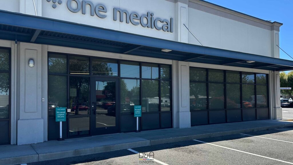
3M PRESTIGE FOR ONE MEDICAL
Standard window tint improves comfort and visibility but does not reinforce the glass. People usually choose it for:
These features improve daily comfort, but tint does not add strength or slow down forced entry.
Security film focuses on keeping glass intact during impact and slowing down forced entry. Its main functions include:
Security film improves safety and intrusion resistance, but it does not replace reinforced or laminated glass systems.
A quick chart often helps people see the real differences, especially when the films look almost identical on the glass. The table below shows how each option performs based on published specifications from major manufacturers.
| Feature | Standard window tint | Security film |
| What it’s built for | Comfort, heat control, glare reduction | Holding broken glass together and slowing entry |
| Typical thickness | Around 1–2 mil | 4–15+ mil, depending on the product line |
| How it handles impact | Glass breaks and falls apart | Glass breaks but stays attached to the film |
| What happens during a break-in attempt | Intruders get through the glass quickly | Film adds resistance and delays access, but does not stop entry |
| UV protection | Up to 99% (manufacturer data) | Up to 99% (manufacturer data) |
| Heat control | Often noticeable, especially in sun-heavy rooms | Usually low unless paired with a tinted film |
| Privacy | Strong daytime privacy when outside light is brighter | Depends on tint level; clear security films offer no privacy |
| Installation notes | Standard installation | May use stronger adhesives or edge anchoring systems |
| Typical lifespan | Around 10–20 years | Around 10–20 years |
Many homes and businesses need comfort and protection, so using both films together is common. A clear security film can go directly on the glass, and a tinted layer can sit on top to cut heat and glare. Manufacturers such as 3M and Llumar confirm that this stacked setup works when the films are compatible.
Some real examples make this clearer. Storefronts with large west-facing windows often pair security film with a dark tint so the glass holds together during break-in attempts while still keeping the space cooler in the afternoon sun. Home offices with floor-to-ceiling windows sometimes mix a neutral tint with security film to reduce eye strain and add protection for kids or pets around the glass. There are also hybrid films that offer tint and safety in one layer, although performance depends on the specific product line.
Combining films does not turn the window into a barrier, but it gives more comfort and more resistance than tint by itself.
Most people know what bothers them before they ever look at films. Maybe a room heats up every afternoon. Maybe glare makes your monitor useless by 2 p.m. Maybe a recent break-in on your street made you think twice about the glass near your front door. In cases like these, tint works best for comfort issues, and security film helps when the concern is impact or forced entry.
Some places need both, like storefronts that stay hot from sun exposure but also sit close to sidewalks and busy streets. If you are not sure which direction to take, the team at DA-Customs can look at your windows, your layout, and your concerns and suggest the option that fits your space rather than a one-size-fits-all choice.
Installing window film is easier when you know what to expect. These steps outline how the process usually goes and what keeps the film in good shape long-term.
Step 1: Prepare the glass. The surface needs to be spotless. Any dust or residue becomes visible under the film once it cures.
Step 2: Install the film. Standard tint goes on fairly quickly because it is thin and easier to position. Security film takes longer due to its thickness and the precision needed for proper adhesion. Large panes or doors may also require edge anchoring for better performance.
Step 3: Allow the film to cure. Both films need time to dry. Some moisture under the surface is normal at first. Full curing time varies by film type and climate.
Step 4: Clean with care. Use soft cloths and non-abrasive cleaners. Manufacturers such as 3M and Llumar advise avoiding ammonia-based products because they can damage the film.
Step 5: Watch for early signs of wear. Peeling, bubbling, or lifting at the edges is not typical aging. It often signals adhesive issues or heavy sun exposure and should be checked sooner rather than later.
If you want help choosing the right film and installing it correctly, the team at DA-Customs can walk through your space, explain the options, and handle the entire process with proper materials and techniques.
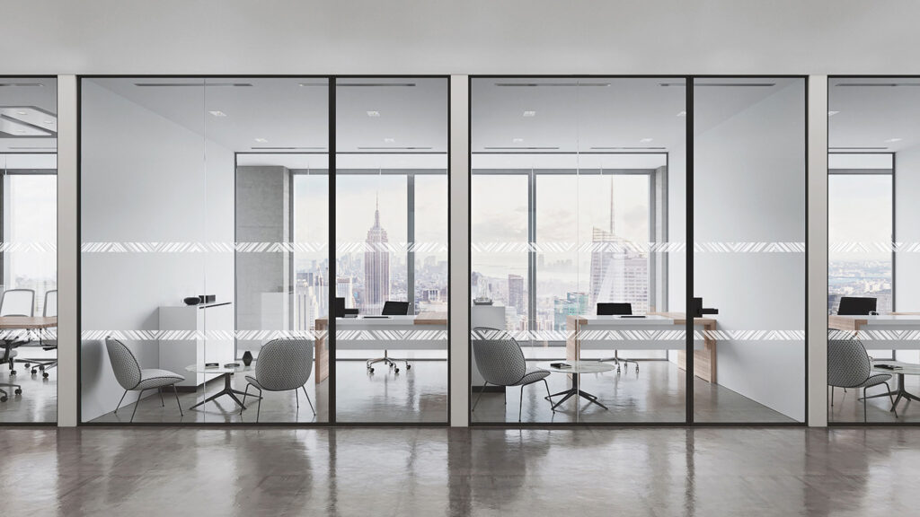
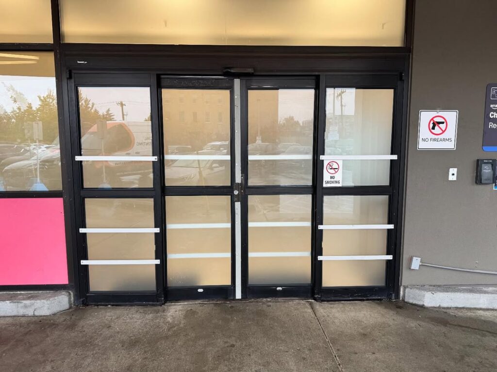
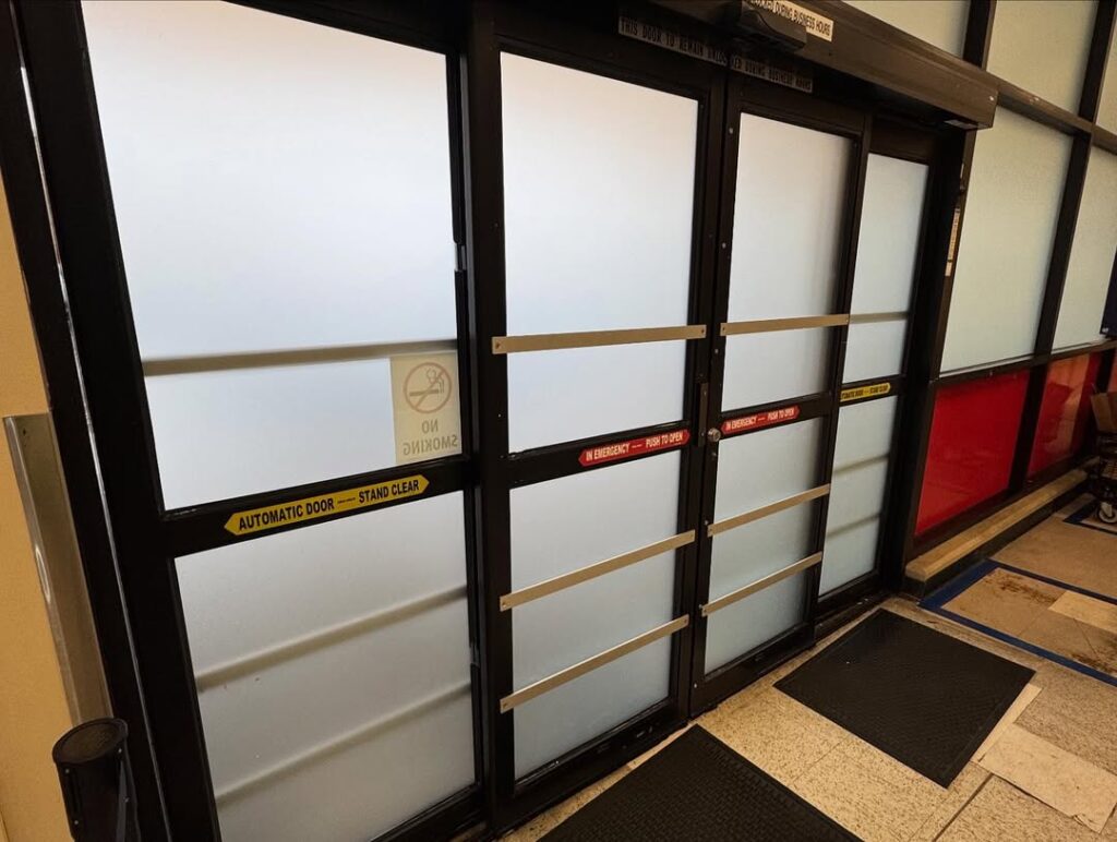
Transparent walls look clean, but unmarked glass leads to avoidable injuries and code issues. Distraction markers make panes visible and help you meet the glass distraction markers code requirements without losing light or style. For example, the latest edition of the International Building Code (IBC) includes rules about visibility and safety for glass in doors and walls. Studies even show that collisions with clear tempered glass often cause serious injuries, so adding markers isn’t just smart, it’s practical.
At D&A Customs, we offer solutions like the distracting band safety frost stripe that both meet code and enhance the look of your space, rather than ruining it.
If you’ve ever watched someone nearly walk into a glass door or done it yourself, you already understand why clear glass warning markers exist. These simple additions make large glass panels easier to see, so people don’t get hurt. They’re not just a nice extra—most states follow glass distraction markers code requirements that make them a must for offices, schools, and shops.
The U.S. Consumer Product Safety Commission reports that more than 20,000 people end up in the ER each year after walking into glass doors or panels. Even a simple frosted stripe, like a distracting band safety frost stripe, can stop that. These markers make spaces safer while keeping the open, bright design everyone loves. At D&A Customs, we help businesses choose markings that look good and keep them on the right side of code.
You don’t need distraction markers on every piece of glass, but there are a few key places where the glass distraction markers code requires them, and where they just make sense for safety. Here’s where they’re most often installed:
According to IBC Chapter 24, markings are needed on glass panels that extend close to the floor or sit near doors and walking paths. Even something subtle, like a distracting band safety frost stripe, can make the difference between a safe space and a painful collision.
We help clients decide exactly where these markers belong so everything looks intentional and code-ready.
Most inspectors want to see distraction markers at two eye-catching levels: about 30 inches and 60 inches from the floor. Those numbers aren’t random. The lower band lines up with someone seated or a child’s eye level, while the upper band sits in the direct line of sight for adults walking by. Together, they make sure the glass is visible to everyone, no matter their height or position.
The International Building Code follows this logic, calling for markings that are “readily visible” and easy to recognize. Most cities use that same rule when enforcing the glass distraction markers code requirements.
The glass distraction markers code ties into more than just stopping people from walking into walls. It also connects with other safety rules that cover exits, stairs, and emergency routes. Basically, if there’s clear glass near a space where people move fast or need to get out quickly, it has to be marked.
That’s why you’ll often see clear glass warning markers right next to exit doors or stairwells. They help people recognize barriers instantly. OSHA and local inspectors can even flag unmarked glass as a safety issue. According to NIOSH, better visibility cues help prevent confusion and reduce impact injuries.
At DA-Customs, we plan for all of that from the start, so your glass looks great, meets code, and keeps everyone safe.
Choosing the right material for your distraction markers depends on how long you want them to stay and what look you’re going for. Here’s a quick guide that makes it simple:
No matter which style you pick, the key is balance: something visible, durable, and suited to your space. At D&A Customs, we help match the right material to your project so it looks sharp and stands the test of time.
You don’t have to choose between safety and style. With the right distraction markers, you can meet the code and make your space look better. Offices, schools, and retail stores often use these markings to prevent accidents and guide people through the space, and tie in brand identity. Well-designed glass graphics can do triple duty: improving safety, reinforcing wayfinding, and enhancing the overall look.
Here’s how different design options work in real spaces:
At D&A Customs, we help clients choose clear glass warning markers that not only keep people safe but also fit seamlessly into the way their space feels and functions.
Installing distraction markers shouldn’t feel complicated, and with DA-Customs, it isn’t. We handle everything from the first site visit to the final inspection, making sure every detail meets the Glass distraction markers code and looks great in your space.
Here’s what happens when you work with us:
In short, we make the process simple and stress-free. Your glass ends up safer, stylish, and fully compliant without disrupting your day.
Adding distraction markers might seem like a small detail, but it makes a big difference. They don’t just look clean and modern, but keep people safe and help you meet the Glass distraction markers code without headaches later.
Before calling a project done, here’s a quick checklist to make sure you’re all set:
At D&A Customs, we handle all these details so you don’t have to stress about compliance or re-checks. Our job is to make your space safe, good-looking, and ready for approval the first time. Need help planning or updating your glass? Reach out for a quick quote—we’ll take care of the rest.
Walk into any modern office or café, and you’ll notice how often people walk right up to a glass door before realizing it’s closed. It happens faster than you’d think, and sometimes with painful results. That’s where glass door stickers’ safety becomes more than just a detail—it’s a practical way to protect both visitors and employees.
A clear marker strip across transparent glass can prevent collisions, help people with visual impairments, and keep a business in line with ADA and IBC guidelines. According to the U.S. Consumer Product Safety Commission, glass-related injuries send over 150,000 Americans to emergency rooms each year, and a surprising share come from doors that weren’t visible enough. Simple safety decals can reduce that risk while keeping the clean, modern look most businesses want.
A glass door looks elegant until someone walks straight into it. That single accident can lead to injuries, damaged property, and even liability claims. So, why do glass door stickers safety matters?
Let’s discuss all the pros in more detail.
Most people see glass door stickers as a boring requirement, but in reality, it’s a clever way to combine protection, compliance, and design.
When safety, compliance, and style work together, you get more than just a sticker—you get a smarter, safer entrance that fits your brand.
When it comes to glass door stickers safety, the design you pick matters as much as where you place it. A good marker not only keeps people from walking into the glass but also fits the look of your space. Most businesses fall into one of a few clear options:
Each of these styles can be customized—frosted white for contrast, grey for a subtle tone, or even tinted to match brand colors. The trick is to choose a pattern that looks intentional and stays visible no matter the lighting. That way, you get a door that’s safe, stylish, and compliant.
The easiest way to mess up with glass door safety stickers is by picking a design that disappears once the sun hits it. What looks great in the catalog can turn nearly invisible in real life. The rule to remember is simple: light on dark, dark on light. A frosted or white stripe pops against tinted glass, while a darker gray or black decal works best on clear panels.
Light changes everything, too. Morning glare, afternoon reflections, or bright lobby lighting can all make glass hard to see. That’s why matte finishes are the go-to choice, they cut down glare and stay clear from every angle. Many offices use etched frost films because they look high-end and don’t peel, while shops with bold lighting often go for solid, opaque patterns that grab attention. The goal is simple: no matter the time of day or the lighting, people should always see the glass before they feel it.
Once you’ve got the right look for your glass door safety stickers, the next step is keeping them in good shape. Doors get a lot of traffic (hands, carts, cleaning sprays), so your stickers need to handle daily life. The best choice is high-quality vinyl film, the kind that lasts 5 to 7 years indoors without peeling or fading.
As for cleaning, a little care goes a long way. Skip the ammonia-based sprays, they can eat away at the adhesive. Instead, use mild soap and water or a soft cloth with a bit of alcohol for tougher spots. It takes just a minute, but keeps the stickers bright and visible. When you treat them right, they’ll stay clear, crisp, and professional-looking for years.
Installing glass door safety stickers with D&A Customs is simple and stress-free. You don’t have to guess where the decals go or worry about code details—the team handles it all with a clear, step-by-step process that keeps your doors safe and sharp-looking.
Here’s how it usually goes:
D&A Customs treats every project like a custom job—efficient, code-conscious, and visually consistent from one door to the next.
In the end, glass door safety stickers aren’t just about ticking a box for inspectors, but about keeping real people safe every day. A clear marker can stop a delivery driver from walking into a glass panel, help a child spot a door they couldn’t see before, or prevent a customer from an embarrassing (and painful) collision. It’s a small fix that makes a big difference.
D&A Customs handles the whole process with care, from precise measuring and design previews to clean, bubble-free installation. The materials we use last for years, resist scratches, and stay easy to clean. Businesses choose this upgrade because it’s smart, affordable, and instantly improves safety without changing the look of their space.
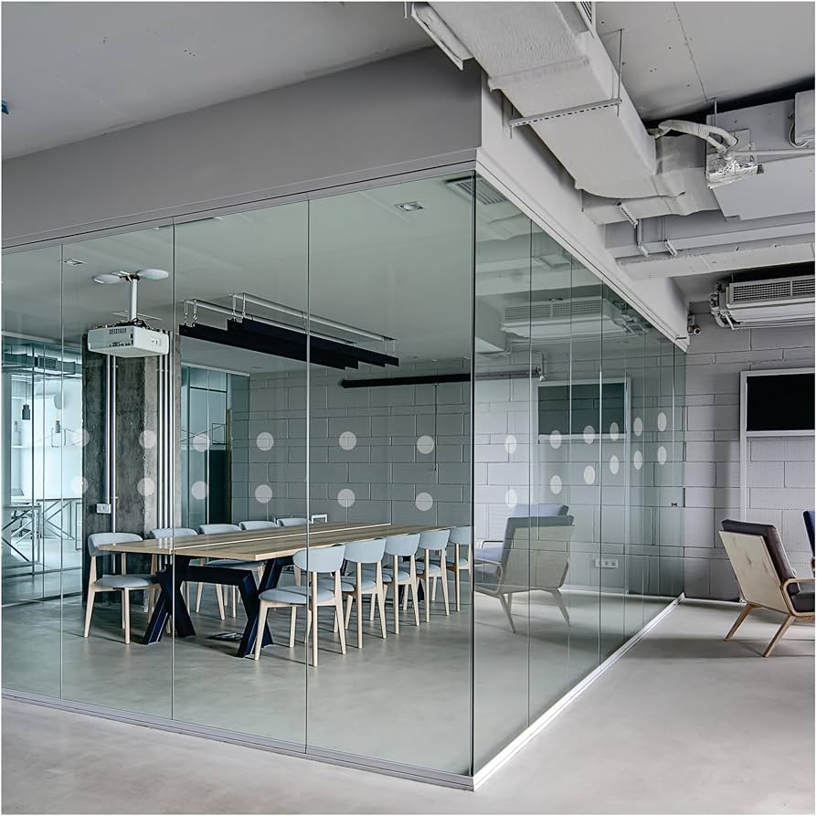
Glass walls make any space feel open and modern, but they can also be tricky because people don’t always see them until it’s too late. That’s where glass awareness stickers step in. A few smart markings on doors and partitions can stop accidents, keep your space up to code, and still look great. This guide walks you through what glass awareness means, why it matters, and how to get it right without losing your style with D&A Customs.
Glass awareness means marking transparent surfaces so people can see them before they walk into them. It sounds simple, but it prevents real injuries. In the U.S., tens of thousands of people visit emergency rooms every year because of glass collisions, according to the American Academy of Ophthalmology. Most of these accidents happen in offices, schools, and public buildings with large glass doors or partitions. A small, well-placed band of frosted film or decals at eye level can stop that from happening.
These markings also help meet accessibility and safety codes in most states, which require visible indicators on clear glass. At the same time, they can serve a design role, using subtle patterns or a company logo, which keeps the space professional without looking cluttered. In short, glass awareness combines safety, compliance, and design in one small but important detail.

In the U.S., glass awareness isn’t handled by one single rulebook—it’s a mix of national codes and local tweaks. Here’s how it breaks down in plain terms:
When you stick to these simple rules, your project stays safe, looks clean, and passes inspection the first time.
Not all glass markings are the same. The right material depends on what your space needs: privacy, visibility, or a bit of both. Here’s a quick look at what usually works best:
In short, the material you pick should fit both your look and your local code. The right choice makes your glass safe, compliant, and still good-looking.
Every successful glass awareness project starts with a solid plan. At D&A Customs, we handle every step carefully so your space meets code, looks good, and stays safe. Here’s how the process works:
By the time we’re done, your glass doesn’t just pass inspection—it fits your space like it was part of the design from day one.
Glass awareness doesn’t have to look dull or technical. With a few smart design choices, it can actually highlight your brand and make the space feel more intentional.
A well-thought-out design keeps people safe and makes every pane of glass feel intentional, not just compliant.
Even simple projects can go wrong if the details are off. At D&A Customs, we’ve seen a lot of glass awareness installs over the years, and a few common mistakes always show up. Here’s what we help our clients avoid:
Our rule of thumb? Keep it visible, consistent, and simple. It’ll pass inspection and look good doing it.
Glass awareness is about meeting code, keeping people safe, and making your space look sharp. A clean frosted band or subtle pattern can stop someone from walking into a glass wall, pass inspection, and still match your style.
If your business is in Bellevue, Tukwila, or anywhere in the Seattle area, we can help you sort it all out. We’ll check local rules, create a mockup that fits your space, and handle the install start to finish. No guesswork, no stress, just glass that looks good and does its job.
Need help with your next project?
Reach out to D&A Customs for a quick quote or on-site review. We’ll make sure your glass is safe, compliant, and ready to impress.
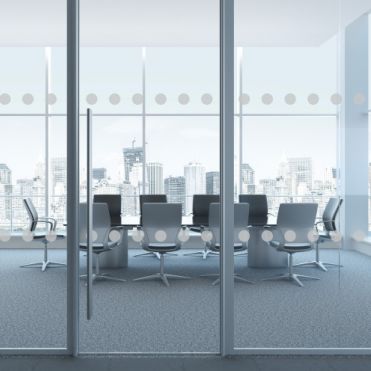
Glass walls and doors look great, but sometimes they can be a little too invisible. One quick way to fix that is by adding round markers—those small circles you see on glass panels in offices, shops, and schools. They make the glass easier to see, help prevent accidents, and still keep that clean, modern look everyone likes. At D&A Customs, we install round markers that check all the safety boxes and look good doing it.
If you’ve ever seen someone walk right into a glass door, you know why these rules exist. Building codes in the U.S., like the ADA Accessibility Guidelines and the International Building Code (IBC), say that large glass panels and doors need visible markings so people don’t accidentally hit them.
Most inspectors look for markers placed around 30 inches and 60 inches above the floor, so they’re visible to adults, kids, and wheelchair users. Cities like Seattle and Bellevue stick to these same standards, and local building departments often check contrast and placement before signing off. Following these simple rules keeps your space safe, up to code, and free from the “ouch” moments.
We’ve all seen it happen: someone’s walking, checking their phone, and bam… straight into a glass door. It’s not just embarrassing; it can lead to real injuries. According to the U.S. Consumer Product Safety Commission, thousands of people end up in the ER every year because they didn’t see a glass panel in time.
Round markers fix that problem fast. Those simple dots make the glass stand out, even when it’s spotless. They’re especially helpful in busy spots like office lobbies, restaurants, and schools, where people move quickly and might not notice clear barriers. And for business owners, they’re a smart way to avoid accidents, property damage, and insurance headaches—all without ruining that clean, modern look.
When it comes to passing inspection, it’s not just about sticking dots on the glass — it’s about doing it right. Most cities, including Seattle and Bellevue, follow the same basic rules that keep everyone safe and happy. Here’s what inspectors usually check for:
At D&A Customs, we always review your local code before installation and make sure your glass meets every requirement, so you stay compliant and your space still looks great.
When you book an installation with us, you won’t have to guess what’s going on. We handle everything from the first measurement to the final inspection. Our goal is to make the process fast, clean, and stress-free while keeping your space safe and up to code.
It starts with a quick on-site visit. We measure your glass, check the layout, and confirm local code requirements so the markers land exactly where they should, typically at 30 and 60 inches above the floor. Then we move to the design phase, where you’ll see a digital proof showing dot size, spacing, and overall pattern. You can make changes before we start, so the final look fits your brand and space perfectly.
Once everything’s approved, our installers arrive with the precision tools they need to get the job done right. We prep the surface, align every row using laser guides, and apply each circle by hand to avoid bubbles or uneven spacing. After the installation, we do a final walk-through: checking height, contrast, and finish, and hand over a care sheet with simple cleaning tips.
Most projects wrap up within a day, depending on the amount of glass. Whether it’s a single storefront or a multi-floor office, you can expect clean lines, zero mess, and markers that look like they were always part of the design.
Adding round markers to your glass is one of those upgrades that makes a big difference without draining your budget. Prices vary based on a few things, mostly the amount of glass, the design you choose, and how easy the panels are to reach.
Here’s what usually shapes the cost:
Most projects take 1–2 days from start to finish, while larger jobs may need up to 5 days. You’ll always get a clear quote from D&A Customs before we start, so no surprises, no vague “starting from” numbers, just honest pricing and a schedule that works for you.
It doesn’t take much to make glass safer; just a few well-placed dots can prevent painful accidents and failed inspections. Whether it’s a storefront where people come and go all day, an office with full-height partitions, or a school hallway with endless glass panels, round markers keep everyone a little safer without changing the design you worked so hard to create.
At D&A Customs, we’ve installed markers on everything from café doors in Bellevue to office walls in Tukwila, and we know exactly what local inspectors look for. We’ll measure, design, install, and check every detail before you even have to ask.
Want to make your glass safer and still look great?
Reach out to us and we’ll give you a free quote and help you choose a style that fits your space perfectly.


